Matthew Sequel Lewis
Graphic Design and Illustration
Information
It’s Freezing in LA! magazine
Projects
Selected press
Awards
Stack Magazine (Shortlisted)
Stack Magazine (Shortlisted)
Stack Magazine (Shortlisted)
Talks, workshops, and live briefs
Camberwell University
Canterbury University
Central Saint Martins
D&AD
Leeds University
Lighthouse Brighton
Norwich University
Kingston University
Winchester University
Matthew Sequel Lewis © 2025
All images on this site are creations by Matthew Sequel Lewis, unless otherwise specified.
London Swiss Medical
Illustration
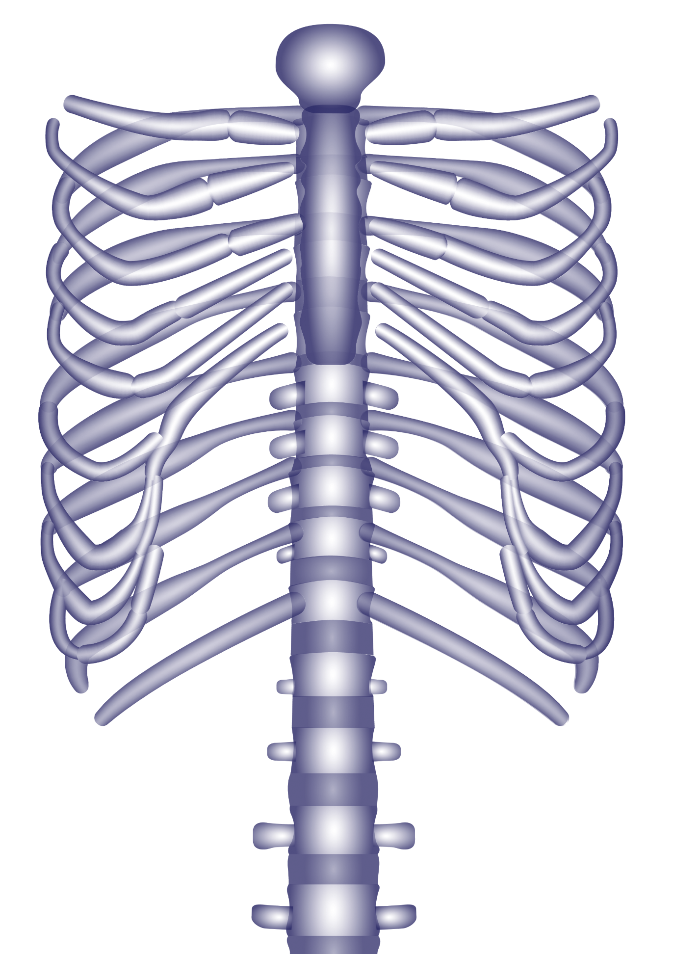
![Female and male bodies, digital drawings - Medical illustrations for an endocrinologist]()
A series of medical illustrations to explain the hormonal functions of human organs were made for endocrinologist London Swiss Medical.
Soft gradients and bold colour combinations were used to make the diagrams more approachable.
The illustrations were published as an interactive section for the client’s website, and throughout their visual identity’s materials.
Illustration: Matthew Lewis
Commissioned by: BOB Design


